


Sign of the times
Spring is looming and businesses are open for, well, business. The near ancient marketing trick of a simple chalkboard has experienced a serious dust off with the rise of social media and from once having been restricted to purely local customers, a successful board can nowadays reach beyond borders with viral hashtags, likes and shares. We’ve all seen them - a witty chalkboard that made us chuckle, snap a picture and add it to our socials. With spring around the corner, the footfall on the streets is set to increase and GalaBingo has spoken to the top experts to, once and for all, reveal the best way to create a successful board.
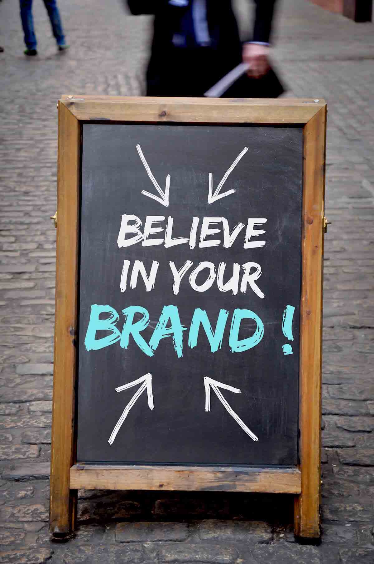
1. Make ‘em LOL: “Skinny people are easier to kidnap. Stay safe, eat cake.” I mean, do you need more convincing than that? Hanna Exall, a chalkboard artist based in Stirchley, Birmingham, emphasises the marketing value: “I think a witty sign can really help a business go viral which is a great marketing strategy. Wordplay and original ideas can definitely help it go a long way.”
2. Bring it home with a pun: “How did the hipster burn his tongue? He sipped the coffee before it was cool.” “You are what you eat, you horrible, horrible person!” A play with words and subversion of their meaning through clever puns are sure ways to bring a smile to the customer, as Hannah Exall indicates from her own experiences: “I collaborated with a pub in the suburb of Harborne at Christmas. The sign read: “Deck Harborne with boughs of holly... falalalala”. It got a great reception from the local community as it was so bespoke to them, and it got a shout out from the M&B marketing team in the Christmas email.”
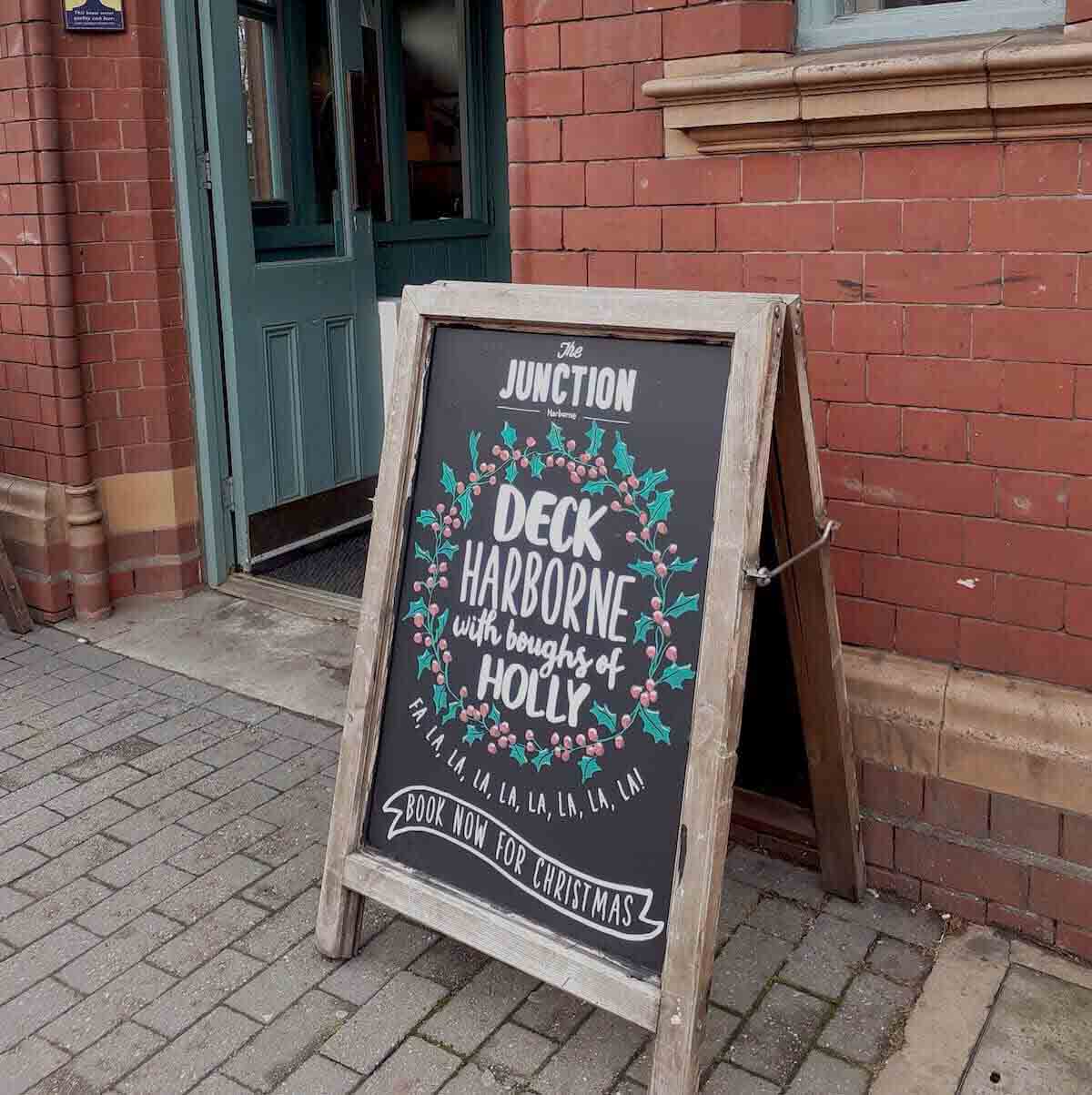
Chalkboard design and photo by Hannah Exall
3. Make it meta: Meta is the self-referential, ironic and unfazed style that is a hit for chalkboards and billboards alike. By exposing old marketing tricks through witty wording, the ad becomes aware of being an ad and suddenly invites the viewer into uncharted territory between customer and company. A closer connection springs and the viral love blossoms. Let the success commence.
4. Keep it simple: We’ve seen some great examples of short, two-liner chalkboards that nonetheless encapsulates the meaning brilliantly. For example, with two simple arrows pointing in different directions, one indicating “Rain” and another one indicating “Cake”, isn’t quite clear which one you choose?
Steve Bird, professional sign painter since 1981, says: “Simplicity. Legibility. Aim to be attention grabbing.” Simple as that, really.
5. Stay sassy: “Free WiFi so you can look at cats and ignore everyone!” Who doesn't prefer looking at cute cats instead of paying attention to the grey, rainy world around you? Cats are great. Cats make the world a better place. We know it, you know it. Now, go get that coffee and perk up.
6. Get personal: “Hungry? We have food! Thirsty? We have drinks! Lonely? We have drinks!” Hits home, doesn't it? A simple play on emotions is a good way to create a connection with the viewer, make them look twice and create a lasting image in their memory.Steve Bird says: “Show me an imperfection, a visible brush stroke, a slightly less opaque font. By demonstrating writing with feeling and from the heart, it’s bound to be appreciated.”
7. The emotions that bind: “We have beer as cold as your ex’s heart.” Oh, haven't we all been there? Pushing the emotional buttons in a funny fashion is a win for the lovesick out there (read: all of us). Steve Bird says: “A uniquely created board sympathetic to the venue and its values wins every time - if the business appreciates the sentiment, it’s likely their customers will too.”
8. Break the rules: By simple play with font size, it’s easy to catch the customer’s eye and make them look another time. “Free WiFi, Hot coffee, Today and every day” doesn't sound that spectacular, but by enlarging three words: FREE, COFFEE, TODAY, while the rest stays small, would make even the most staunch teetotaller look twice.
9. Stay relevant: No harm in getting on the bandwagon while you can. In the midst of the Clooney Nespresso era, one café took to the board and scribbled: “Our espresso is the “what else” that George Clooney was talking about.” Clever, recognisable and punny. We like it.
10. Don’t forget the aesthetics: Damian Whyatt of Damian Whyatt Signs based in Stockport, gives his advice: “Keep it simple, create a good layout, know how letters should look to make an impact.” And Hannah Exall agrees: “I believe in three main points, namely: creative but clear font choice, decide layout before getting stuck in, and use reference points if illustrating.”
Special thanks to the aforementioned chalkboard aesthetic experts: Steve Bird, Hannah Exall Designs and Damian Whyatt Signswriting